Search V1: Introducing Quick Search-ability
t2 is a platform where writers and readers find their niche communities. When t2 first started, there were too few pieces of content to search through. However, as the platform grew, we start receiving multiple feedback that our users were unable to search for other users, content (posts and prompts), and territory (community groups) within t2.
(IMAGE OF USER PROBLEM)
I designed Search V1, a feature that improves quick navigation and search-ability of content, people, and Territories (niche writing communities). Search V1 was designed to be within the global navbar with a Command+K modal shortcut for improved accessibility, as well as a tabular navigation within the search results page for a more granular search experience.

User requests for Search function
Key Solutions

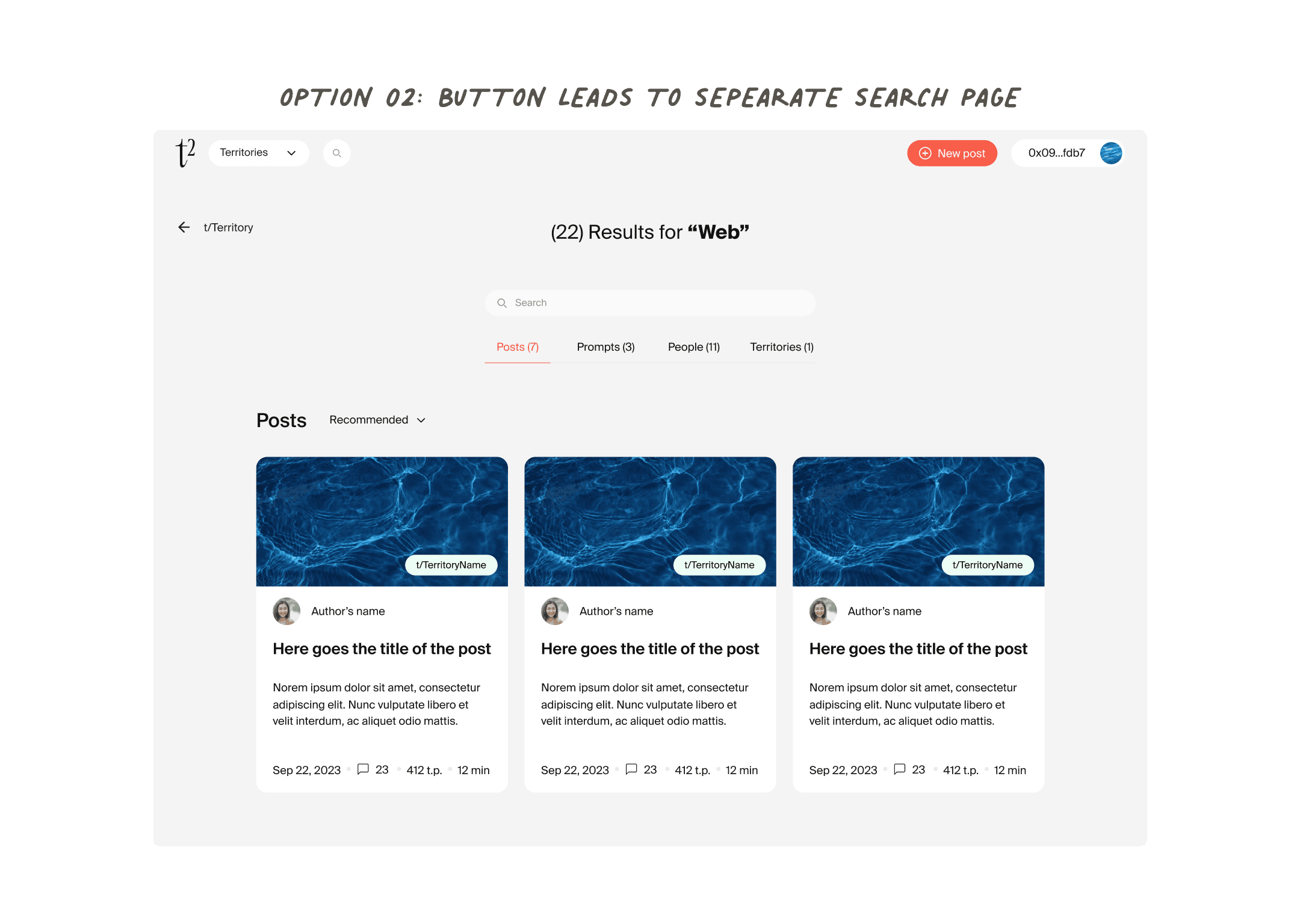
Choosing a Search Experience
Choosing Option 03 - Command+K Modal design
With Search V1, we wanted to bring a more modern UX pattern to t2. We believed that this search experience would be Search V1, and with the hopes that this search experience could be expanded into a command menu in the future, we went with the modal experience as it added the most flexibility for future iterations. This was a chance to test out introducing shortcuts on our platform for easier accessibility.
Creating the Modal Design within Resource & Time Constraints
We used existing components from a Flowbite Component library to reduce resource and increase speed to build the search bar, modal, and the tab components on the search results page. I modified the flowbite component to fit within our design library, but also worked closely with my engineering team to make sure any modifications also would be accessible to build in time with the flowbite’s react library.
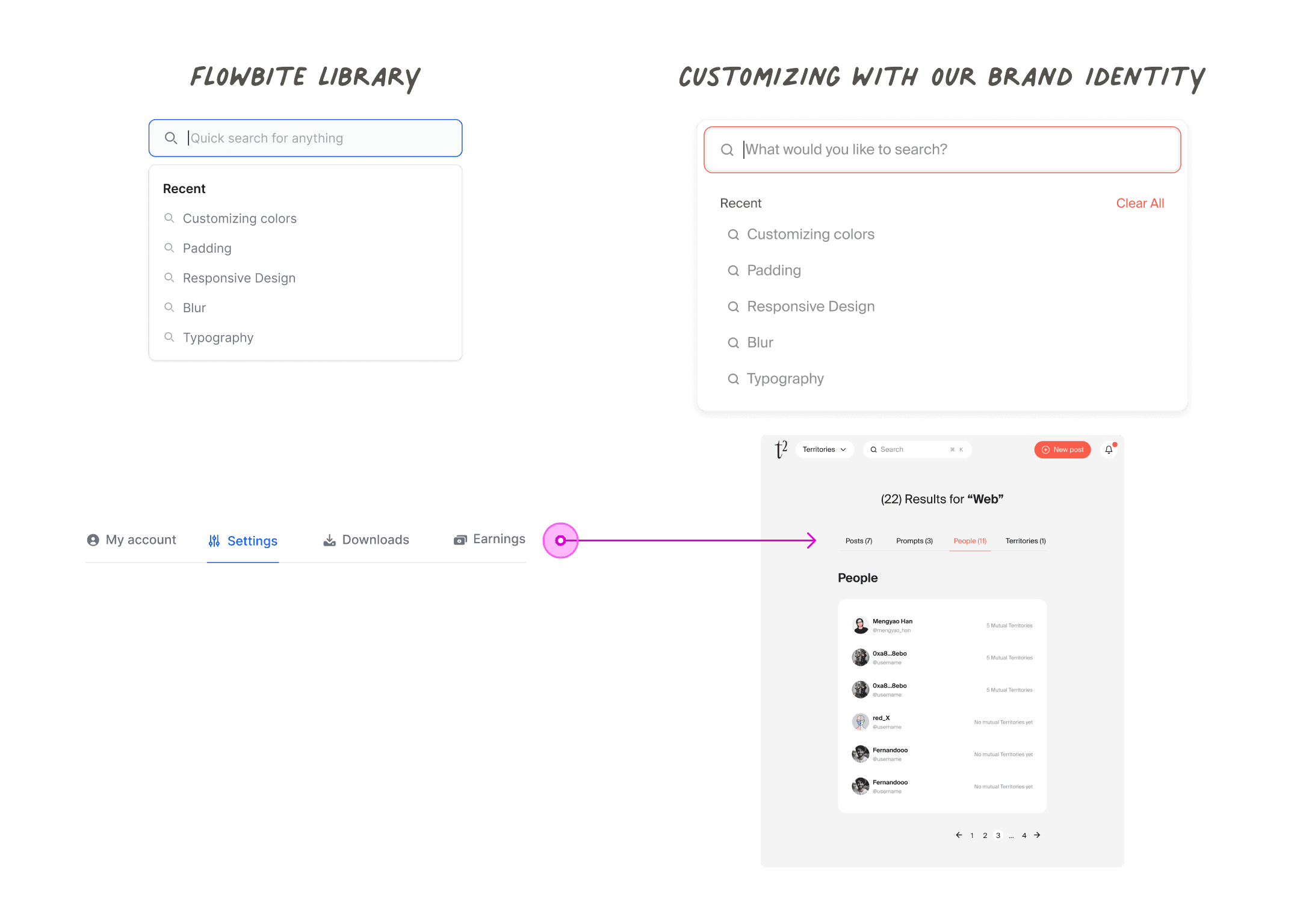
Using Flowbite Library Components for faster build
Aligning on a Search Logic
I had a design critique with my engineers and product manager for us to go over the prototype designs at the initial stage, and to patch up what is possible for the search logic, especially with the backend and what is within our MVP scope due to resource constraints.
For example, elastic search was out of scope, but implementing a search history (and predictive search based on the search history) was possible.
There would be a results page could show the overall results, as well as the number of search results within a tab sorting of “People”, “Posts”, “Prompts”, Territories” which would allow users more granular search for the most popular types of categories on t2. The results page would include pagination and a max results per page, which would improve the load performance as well.
Designing the Final Details
Once the overall UX direction was established, I worked closely with the engineers to make sure designs considered the details, such as loading states, empty states, edge cases, and adjustments for other device breakpoints.(IMAGE OF USER PROBLEM)
Measuring Impact
Navigation Issues Resolved: Complaints about navigation dropped from 45% to 20% in user surveys—a 25% improvement.
Bug Reports Reduced: Navigation-related bugs decreased by 50%, reflecting improved app functionality.
Retention Boosted: User retention saw a 1-2% uptick in the first week after launch, indicating strong feature adoption.
User Satisfaction Increased: NPS scores improved by +10 points, highlighting greater user loyalty and satisfaction.
Learnings & Reflections
Personally this is one of my most used features on t2, and one of my favorite projects, as I loved doing research on building a command+K menu. Our app frequently hosts writing challenges where users search for each other and Territories, so this was one of the most functional features that we immediately saw impactful results with!
This was the feature that made me realize how much I love the concepts of improving search and toolbar functionalities to speed up a workflow. For example, building the command menu with help menus and onboarding materials within the search menu.